See where names sit in their relative-strength rotation cycle.
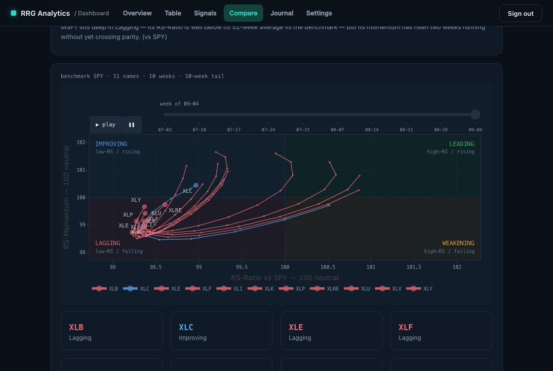
A weekly Relative Rotation Graph for your own ticker universe, measured against a reference index, with what moved and the patterns observed, delivered every Friday as a dashboard and a PDF. Right = stronger than the name's own usual relative strength, up = its 4-week change above its usual level.
This is the measurement itself — real weekly output, not an illustration. Head = latest week, tail = the path there.
What moved this week
vs SPY · largest quadrant changesPricing
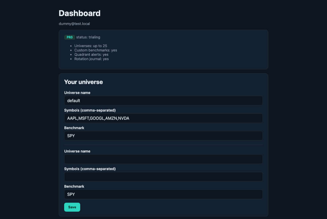
- Up to 25 saved universes, measured weekly
- Dual benchmark — vs SPY and vs sector ETF; custom reference indexes
- The complete RRG: quadrant positions, ten-week tails, ranked table
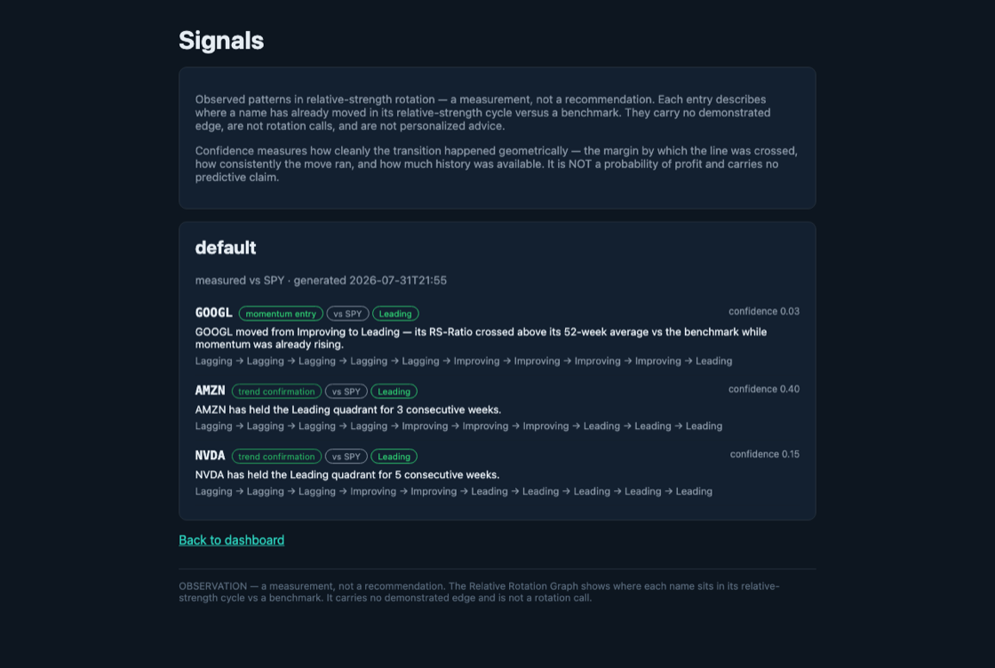
- What moved this week and the seven observed rotation patterns
- Quadrant-transition alerts by email
- Rotation journal — forward-tracked, neutral-scored
- Self-contained weekly PDF by email — open anywhere, keep forever
What you get
Screenshots from the sandbox tenant on sample data — the same views every subscriber gets.
The same measurement, over the API
Tenant-scoped keys, JSON in the exact shape the dashboard and the PDF read — one stored snapshot, every surface agrees.
curl -H "x-api-key: $KEY" https://your-host/api/v1/rrg

{"api_version": "v1",
 "disclaimer": "This is a measurement, not a recommendation. ...",
 "universes": [{"universe": "default", "benchmark": "—",
   "generated_at": "...", "in_progress": false,
   "points": {"—": [{"date": "—",
     "rs_ratio": —, "rs_momentum": —}], "...": "..."}}]}
28 seconds of the product
The interactive demo, recorded: the weekly rotation animated over ten weeks. Silent; the live version is the same page you can explore now.
What this is — and isn't
A descriptive measurement of relative strength and its momentum. It does not tell you what to buy or sell, makes no claim of an edge, and does not manage a portfolio. You read the chart; the decisions are yours.